

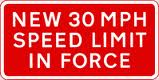
I occasionally allow myself to become exercised about things out of all proportion to their importance. Take, for instance, the signs that have for several months now been on the stretch of the A904 between the Forth Road Bridge and the works for the new additional bridge, which for some reason is called the Forth Bridge Replacement Crossing:
I am enraged every time I see them.
I know I shouldn’t be, that it is a matter of no real importance, but there is a kind of clumsy stupidity implied in them which annoys me. Every single thing about them is wrong: the shape, the colour, the wording – they are as deficient as it is possible for a sign to be, yet doubtless the woeful creature responsible for them thought the message could not be clearer.
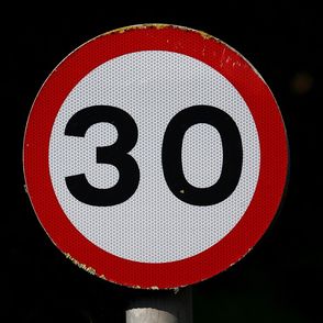
Ah, but it could. If the sign was circular, with a red border round a white background on which the number 30 appeared in black, it would convey with authoritative force that the speed limit in that area is 30mph. It would do so because, in this country, all speed limit signs are of that pattern.
A sign of that sort is all that is required here.
Instead, we have one whose shape and colour suggests that it conveys information about roadworks instead of instruction about a mandatory speed limit. And the wording, far from being clear, is a mixture of falsehood and redundancy, and serves only to sow confusion. Take that first word, ‘New’. These signs have been in place for several months now: you might argue that the limit to which they refer was new on the day they were put up, and may have remained so for a short time after – a matter of days, a week at most; but by now it is certainly false. But why is it there at all? The novelty of a speed limit has no bearing on its validity. If you are inclined to be charitable, you might say that the intention is to alert the driver to the fact that the limit has changed from what it was formerly, but there are several objections to this.
The first is that, in any case, it is the responsibility of the driver to heed the signs – though he is entitled to expect them to conform to the accepted convention. But here, the word ‘new’, in combination with the shape and colour, makes the sign misleading – the driver is led to think that it is a warning of things to come, not a statement of what presently obtains. This is reinforced by the lack of any conventional speed limit signs to say unambiguously what the limit actually is. If the aim was to alert the driver to the change, then surely a conventional sign with an additional ‘new limit’ would have done that? But instead we have – as the last, unexpected line of the message – ‘IN FORCE’ – words which are entirely redundant and have only been added because, having chosen the wrong shape of sign, the writer is now concerned to reinforce the message that the right shape of sign would have conveyed immediately and at once. (And while we are on redundancy, why specify 30 mph? all our speed limits are in miles per hour)
I think that is what annoys me: the whole thing is a series of bungling attempts to disguise a fundamental flaw, attempts which, instead of remedying the fault, serve only to draw attention to it, like a lazy shop assistant trying by ingenious devices to force your foot into a boot that is too small (such things do happen: see here if you doubt me).
Interestingly, this little matter sheds some light on two areas often thought obscure: semiotics and structuralism. Semiotics (or semiology) is the study of signs and how they convey meaning. This case illustrates well the important role of conventions: once we are agreed that a particular pattern of sign conveys a specific meaning, the pattern itself communicates that much more powerfully than words (indeed, as a general rule, our signs use symbols to convey meaning, and where words are used at all, it is in a supplementary role).
Structuralism is the idea that meaning is created along two axes, the horizontal and the vertical. Thus, in a sentence, any word is related horizontally to those on either side of it, and this helps define its meaning – so that in English, ‘The cat sat on the hat’ means something different from the same words in another order ‘the hat sat on the cat.’ But the vertical axis relates any word to all the words that could have stood in its place, which also help define its meaning – so in the sentence quoted, ‘the cat sat on the hat’ has an element of surprise, since we might have expected ‘mat’ rather than ‘hat’.
This opens up an important strand of meaning that we commonly ignore, namely that what a thing means to us is defined as much by what it is not as by what it is – and we see that in the case of the signs, where the fact that the rectangular red sign with white letters is not a round white sign with a red border and black numbers is what weakens and confuses its message and undermines its authority, for all the apparent clarity of its content.
